
A Good Teacher’s Website
What makes or breaks a good teacher’s website?
As online learning has gained momentum over the past decade, many experts have recognized the opportunity to share their knowledge and skills with the world. Some aim to use their teaching to enrich lives and build community. Because website-building tools have become more affordable (even free) and intuitive, the goal of sharing is now highly achievable. We are seeing a wide variety of online classes and platforms emerging to attract curious learners and audiences.
A high-quality instructor’s website should engage and retain its audience, ultimately achieving the goals of knowledge transfer, lifelong enrichment, and community building. To help new instructors understand what constitutes a successful website for adult learners, I have researched and reviewed five websites.
Below, I have summarized the effective use of communication strategies as well as several "lessons learned" that you should avoid when building your own teacher’s website. First, I want to share the elements I find most effective, features I would recommend implementing on every teacher’s website:
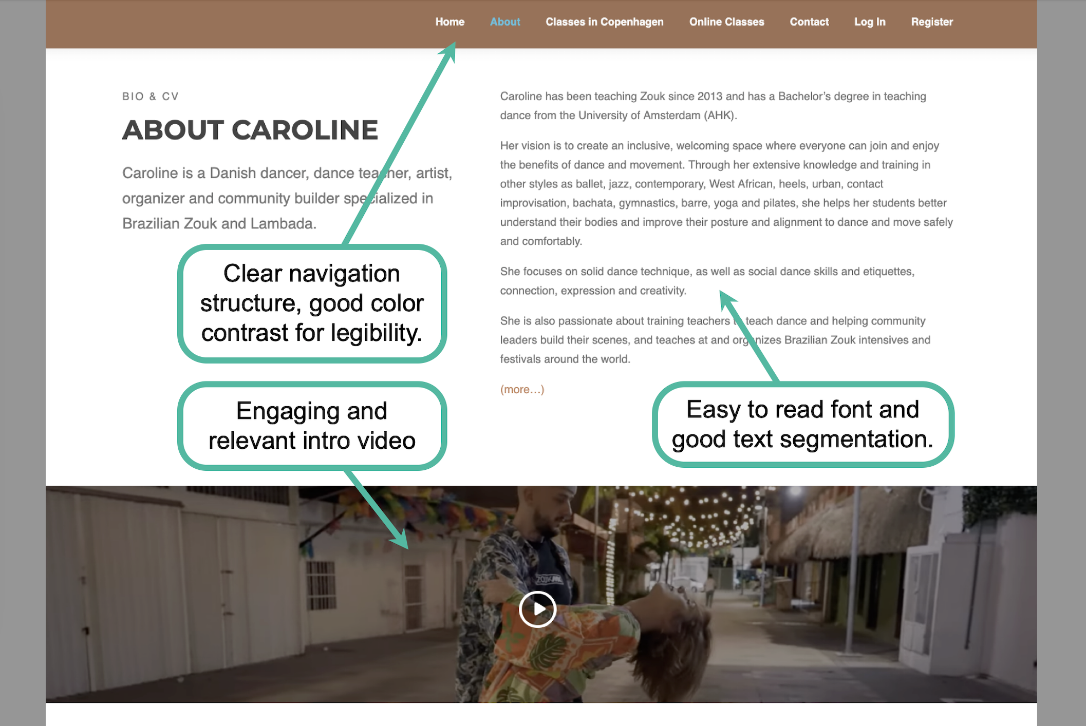
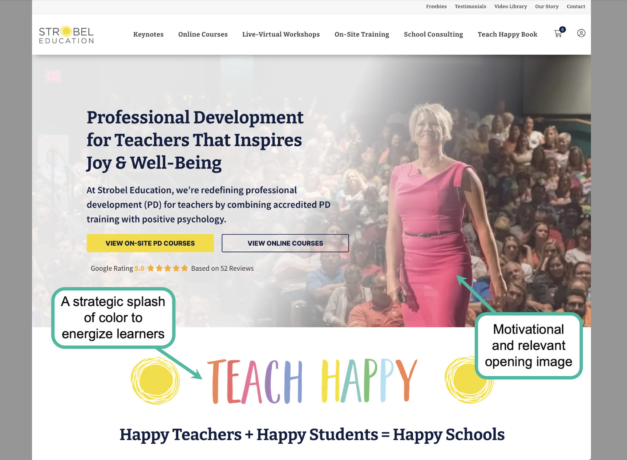
Clear Webpage Navigation: A website with a logical navigation structure makes it easy for learners to find the information they need. The examples below (Images 1 & 2) are excellent representations of strong communication design. Their navigation banners are positioned at the top of the page, indicating major content categories in a way that is simple, clear, and visually pleasing.
Engaging and Relevant Content: On the same website mentioned above (Image 1), Caroline, a dance instructor, uses a video introduction to visually engage her audience from the moment they arrive. This content is both relevant and highly effective. It not only showcases her expertise and passion for partner dance but also demonstrates the tangible results students can achieve. Similarly, the use of relevant visuals in Image 2 motivates and engages users as soon as they land on the site. Strategically using a vibrant color palette tailored to your target audience can also boost engagement and set a positive mood.
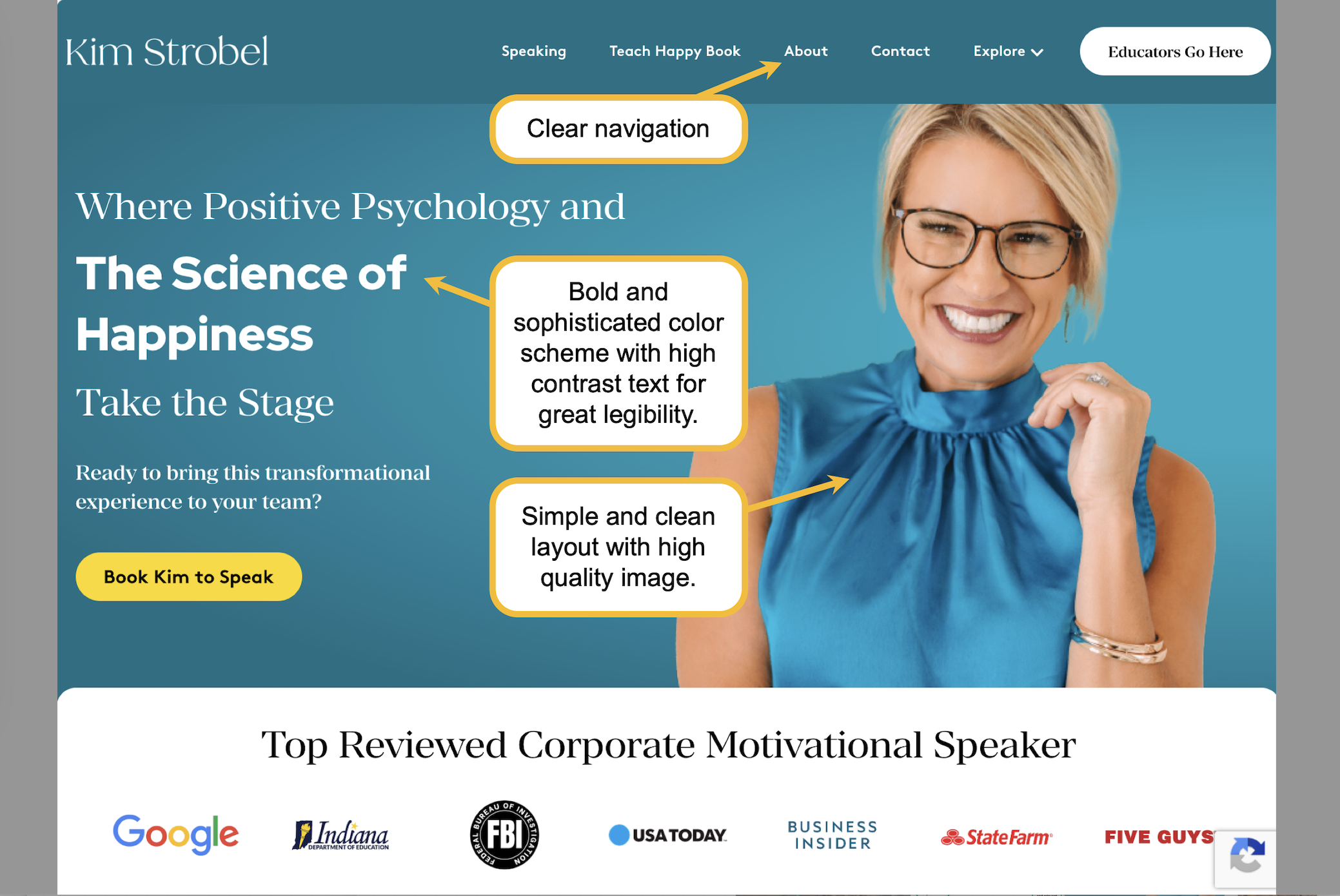
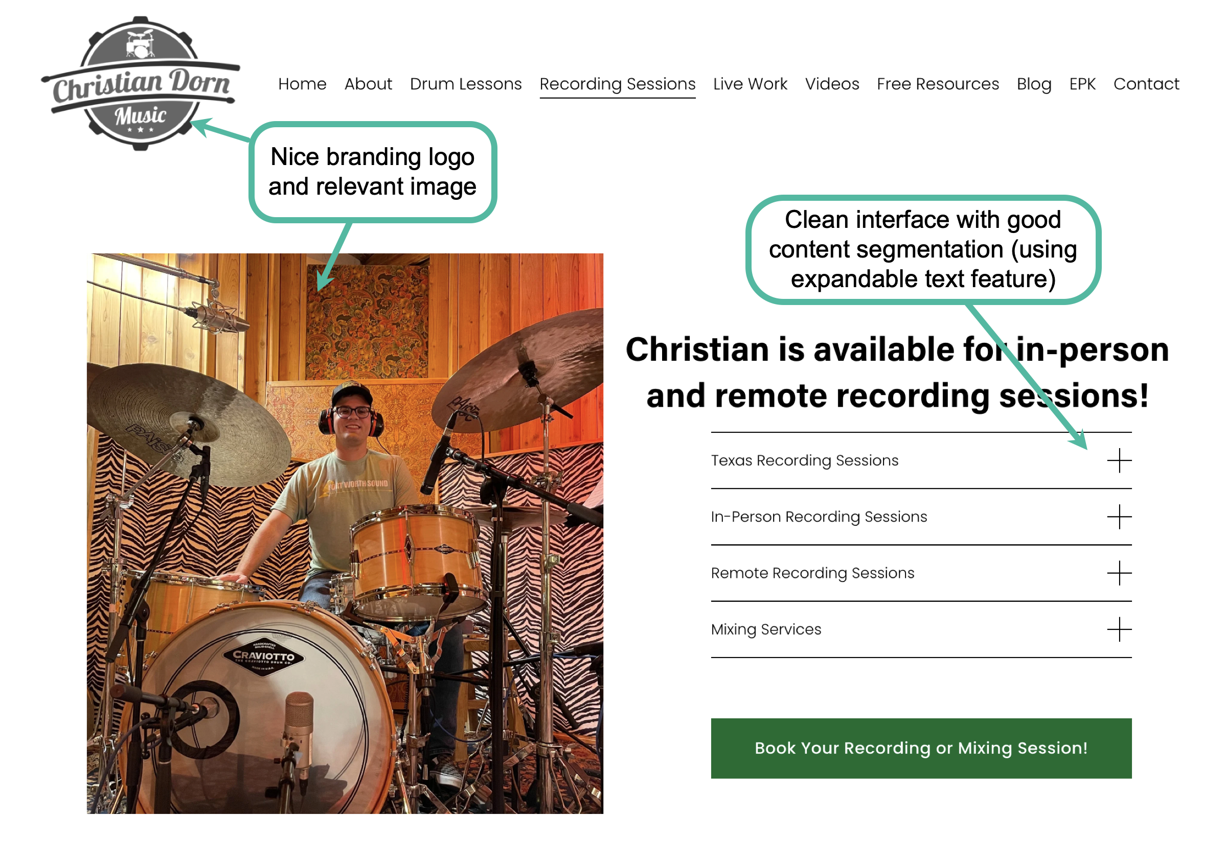
Professional Presentation: An effective presentation is the sum of many parts working in harmony. These elements include, but are not limited to, the webpage color scheme, font and size choices, layout logic, content segmentation, and the use of high-quality visuals. For example, in Image 3, Kim Strobel uses a "punchy" color scheme and a professional portrait to welcome visitors into her world. Meanwhile, Christian Dorn (Image 4) cleverly utilizes collapsible design features to segment content, making it incredibly easy for users to navigate and digest information.
Accessibility Mindfulness: All of the websites mentioned above demonstrate a clear commitment to accessibility. Their text is easily legible, the layouts are clean and free of distractions, and navigation is intuitive. Furthermore, these instructors show an awareness of the diverse ways their target audiences process information. By utilizing a multimodal approach, incorporating images, audio, and video, they ensure their content appeals to various learning preferences and cognitive strengths. Not shown here, but if you have an audience from various language backgrounds or have hearing impairment, offering a site translator and audio aids would be much appreciated.
In my review, I also encountered several less-than-ideal implementations. Here are a few common mistakes you should avoid when building your own website:
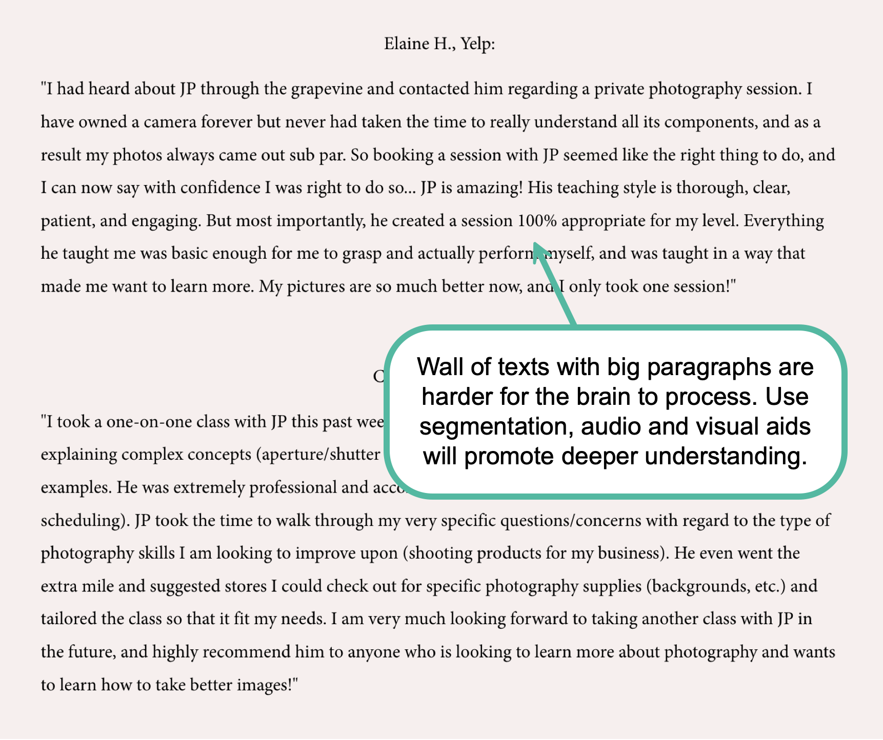
High Cognitive Load: Effective communication requires information to be presented in a way that is easy to process. For example, in Image 5, long and dense paragraphs of text create eye strain and a heavy cognitive load for readers, which can lead to frustration and high "bounce rates" (users leaving the site). To prevent this, use clean, simple typography for large sections of text. Additionally, break up long passages into smaller, digestible paragraphs and utilize bullet points. This creates white space, which allows the reader's eyes to rest and helps them process information more efficiently.
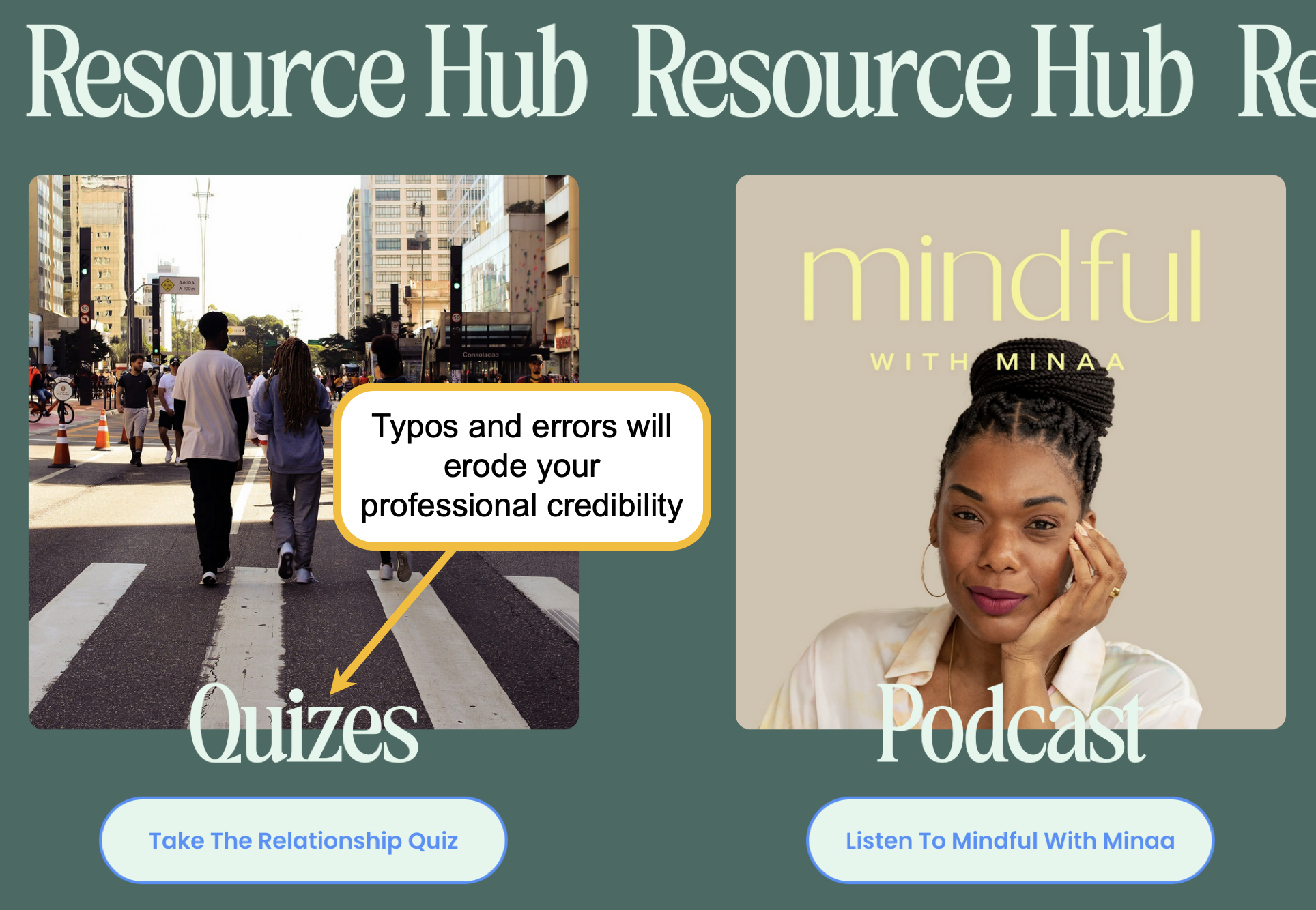
Erroneous Content: If your website contains typos or grammatical errors, it does more than just confuse your audience; it undermines your credibility as an expert. In Image 6, a misspelled word was featured in a prominent, large font. This immediately raised a "red flag" regarding the instructor's professionalism and the overall quality of her content. Always double and triple-check your copy before publishing.
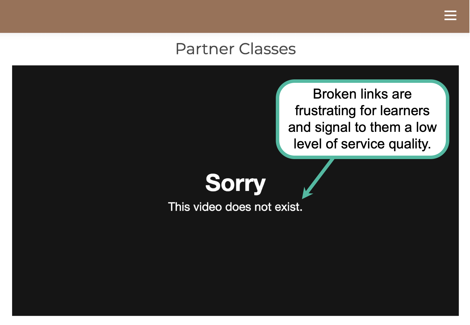
Broken Links: Links that are broken or lead to incorrect pages are frustrating and disorienting for users (image 7). These technical errors disrupt the learning flow and can make a site feel abandoned or poorly maintained. Ensure that you test the functionality of every link before publishing your website.
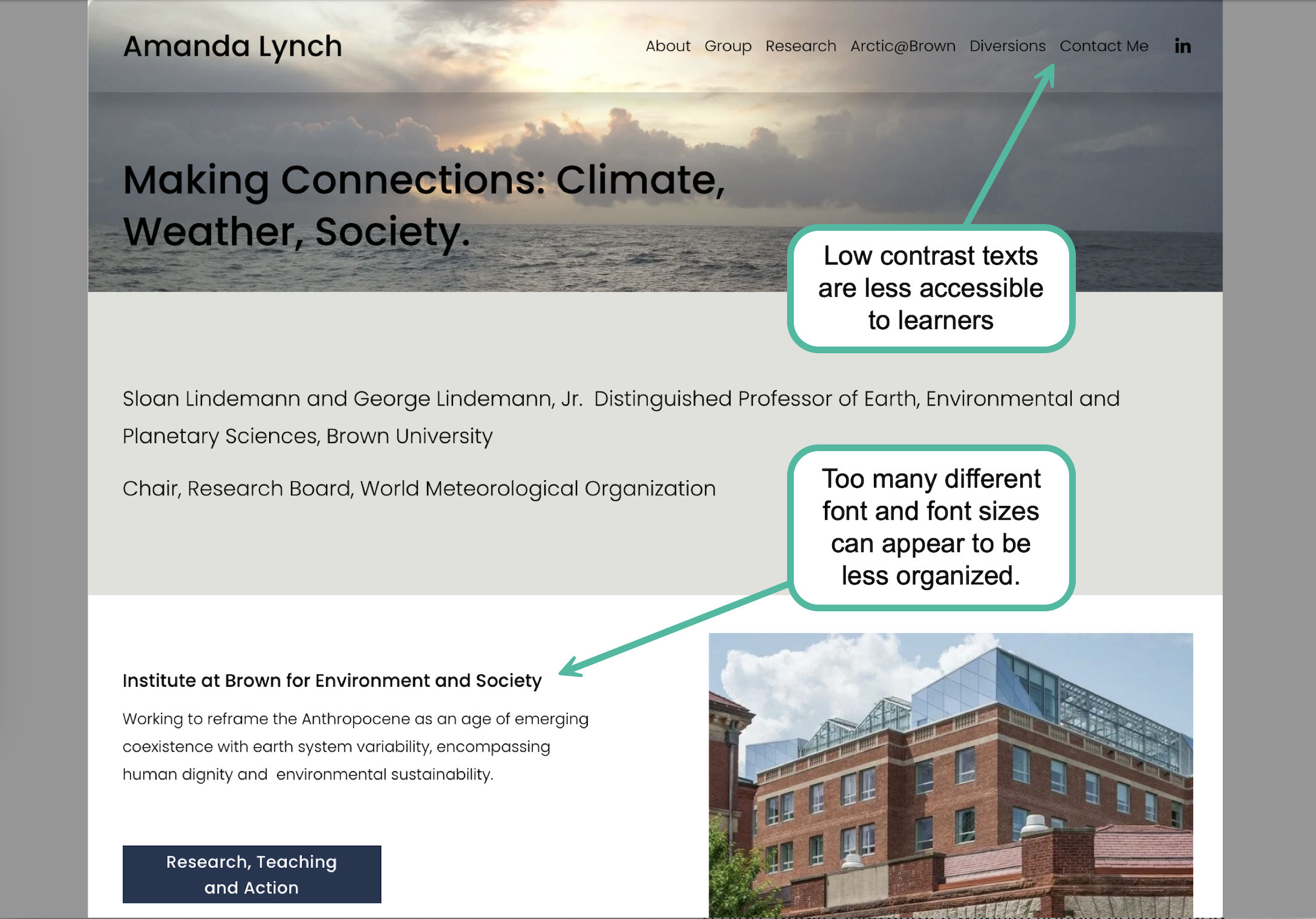
Lacking Accessibility Features: A teacher’s website should prioritize usability for the widest audience possible. At a minimum, this means ensuring that content has sufficient color contrast for legibility, that fonts are large and easy to read, and that the layout is logically organized. Whenever possible, provide multimodal support, such as audio tracks for text-heavy pages or captions for video content. Designing with accessibility in mind ensures that learners of all abilities can engage with your expertise without barriers.
Let me know if you have other effective strategies or lessons learned to share.